HUB21 is an Ed-Tech company that aims to support young individuals in mastering the fundamental tech skills of the 21st century such as coding, game development and creative tech.
As many other brands that work with us, HUB21 was trying to expand its services in the European market. However, its old brand identity did not reflect the innovative nature of HUB21’s business model. And this is where NOA chimed in—to create a playful brand identity and communication strategy that perfectly reflect the story & mission of HUB21.

When we started working with HUB21, we immediately connected with the team and saw how dynamic and passionate they are when it comes to Ed-Tech. But something was missing: a branding that matched the vibe of their team and innovative approach.
So, the first thing we did was to get to know them, their vision and their dreams about educating the younger generations on the skills of the new digital world.
First, we started with the brand strategy which not only served the HUB21 team in establishing a solid foundation for their work but also aided us in crafting a strong and unique communication strategy.
We applied the golden circle methodology and defined HUB21’s “how, why, what” which led us to its purpose, mission, vision, brand story and value proposition. As for the brand personality, we knew who HUB21 was without a doubt: A combination of Creator and Magician archetypes!


HUB21 had two target audiences: The young individuals and their parents. The generational differences between these two audiences “trapped” HUB21 in a place where they did not feel like they could showcase their dynamism while at the same time preserving their serious and instructive tone.
To rescue HUB21 from this so-called limbo, we crafted a communication strategy to assist them in defining their tone of voice in social media that would help them reach out to their target audience with perfect accuracy and efficiency. While doing so, we also made sure to keep aligned with the brand strategy at each step.
While doing so, we ensured everything is aligned with the brand strategy.
Defining the communication channels and their unique strategies were essential for HUB21. For LinkedIn, they needed a more professional and informative tone of voice to communicate effectively with the parents and gain their trust, while the nature and the algorithm of the Instagram platform allowed their messaging to be a little more on the playful side.
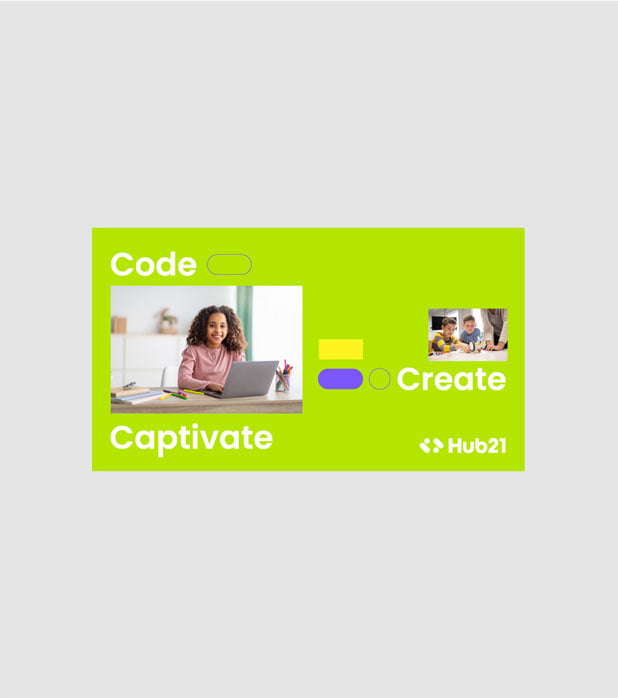
To differentiate HUB21’s communication strategy from its competitors in the European market, we created a concept revolving around the idea of young people owning 21st-century skills. This helped them convey their messages with an important message behind and spark curiosity both in children and their parents.

After creating the brand and communication strategy, it was time to bolster these with an outstanding brand identity that shone a light on both the trustworthy and the fun side of the brand, all at the same time.
HUB21 wanted a non-generic, unique logo that aligned with the brand. So, we turned to the coding world for inspiration! Two dots and two dashes unite to create HUB21’s symbol: always on the move, always curious. The dots and the dashes represent the “less-than” and “greater-than” signs which are the fundamental elements of coding.
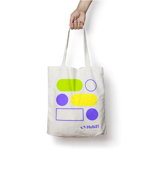
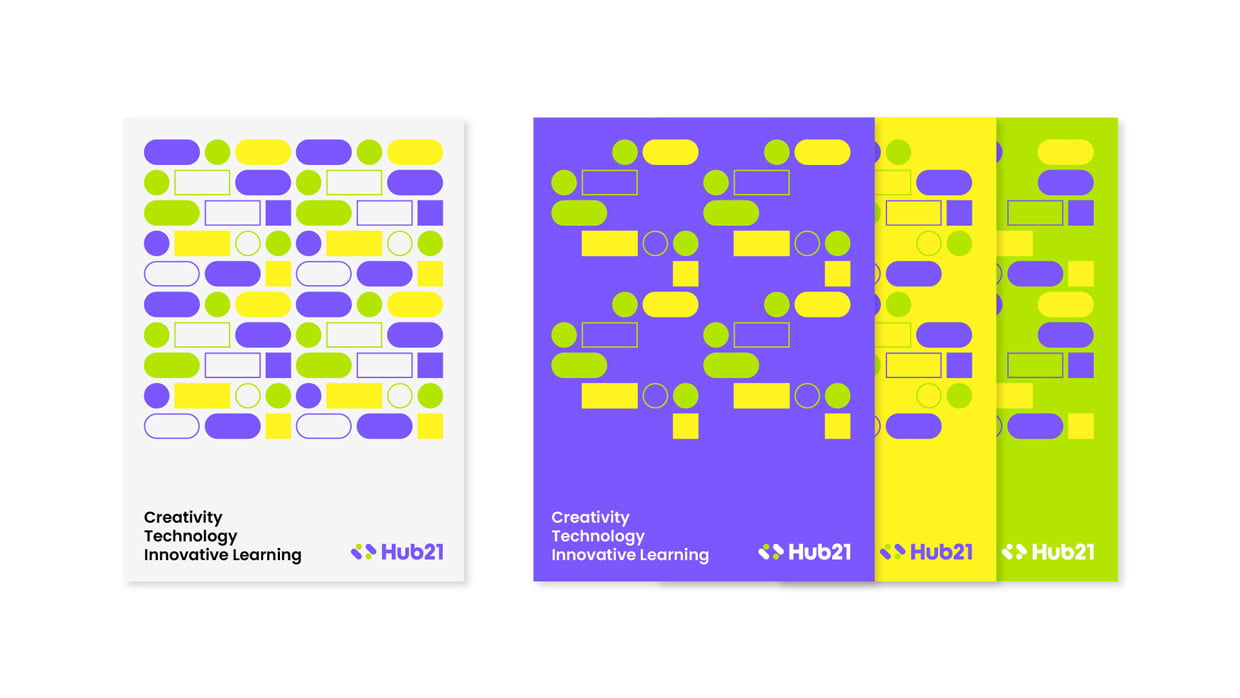
For the colors, the HUB21 team liked their initial purple color and asked us to make additions to the color palette that complement their choice. We picked a vibrant green to match the purple, with the two contrasting colors representing different yet complementary values: future-looking and fun!
The colors were then combined in a systematic method to ensure that everyone who sees it, will think of HUB21.
As for our secondary colors, we chose core colors to use in cases where we want to express more dimensions and diversity of HUB21.
Thanks to the solid strategies and their execution by our creatives at NOA, HUB21 established itself more confidently within its ecosystem. We are proud to see how HUB21 evolved into a brand that can reflect its valuable purpose and speak with its audiences confidently.