Ying Young is a new generation underwear brand that exists to unveil the unique superpower of young individuals on their journey of authentic self-discovery.
Our collaboration with Ying Young was meant to be. Ying Young is what we call a perfect client, the brand approached us with one purpose in mind: building a one-of-a-kind brand identity.
(And that’s exactly what we did.)
Ying Young’s team wanted to create an honest connection with their audience — mainly young girls — around the idea of self-love and authenticity.
To realize their vision, we started by developing a comprehensive brand strategy while keeping Generation Z and their values in mind.
What do people from this generation think and feel? What defines their emotions? We went on to do comprehensive interviews to answer crucial questions such as these which helped us shape the essence of Ying Young.
After careful consideration and a couple of inspiring brainstorming and strategy sessions, we created a brand stance for Ying Young which was defined by a brave and progressive mindset that reflects and understands the point-of-view of young women experiencing the turbulent phase of adolescence.
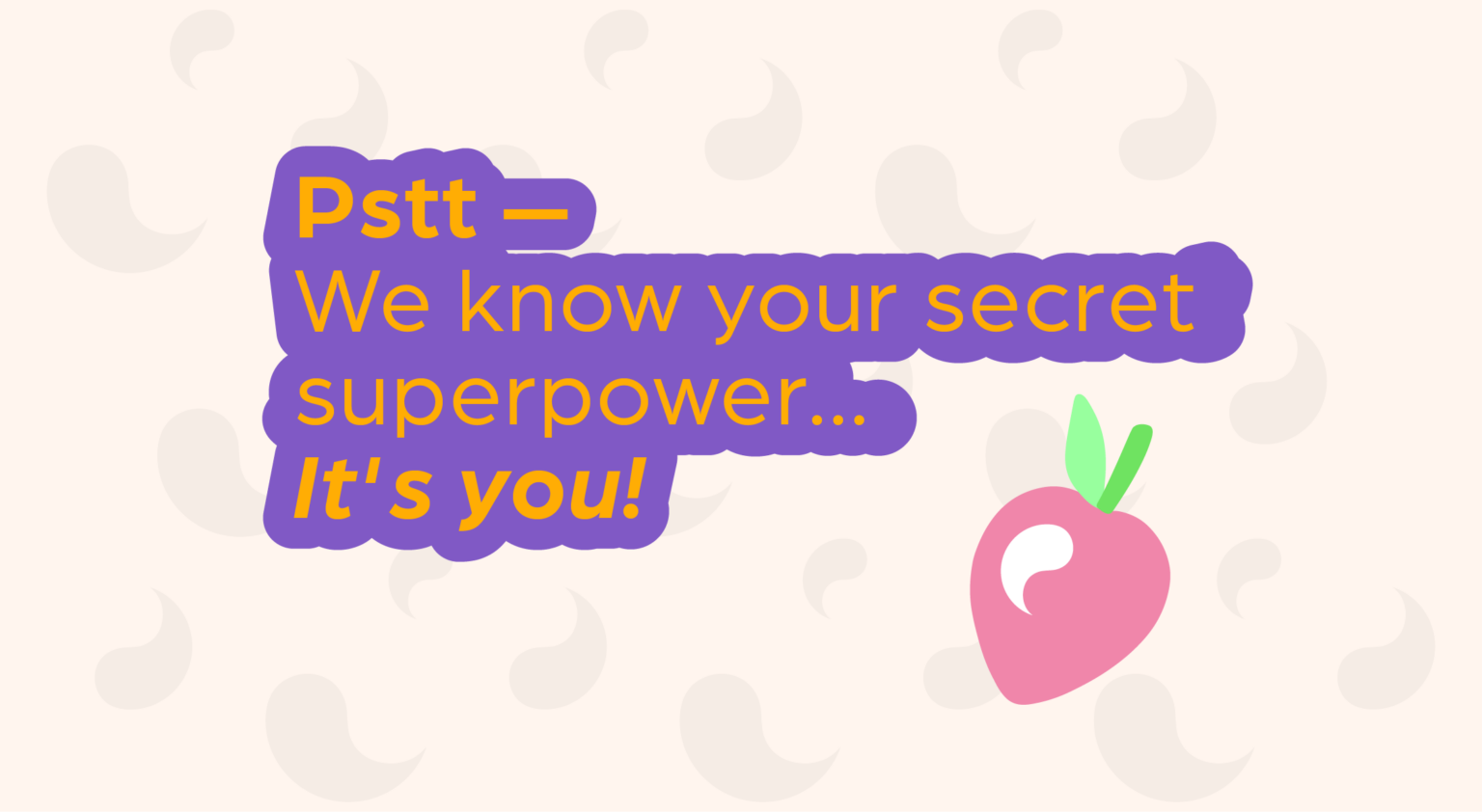
Brand messaging came quite organically, once we were done tailoring the strategy for Ying Young. Playful and reassuring wording that motivates self-love and elevates body-positivity were our go-to choice.
Here comes the best part. To conceptualize and create all the brand identity elements, we drew inspiration from the symbol of Yin and Yang, the ancient yet widespread Chinese philosophical concept.
According to this philosophy, all matter in the universe has yin and yang aspects inherently (e.g. a shadow cannot exist without a source of light). Spotlighting the balance of contrasts and the flux of the universe, we thought this was a great metaphor symbolizing the ups-and-downs of this unique period of a girlhood. An ancient wisdom reshaped in the language of Gen-Z — how cool is that?
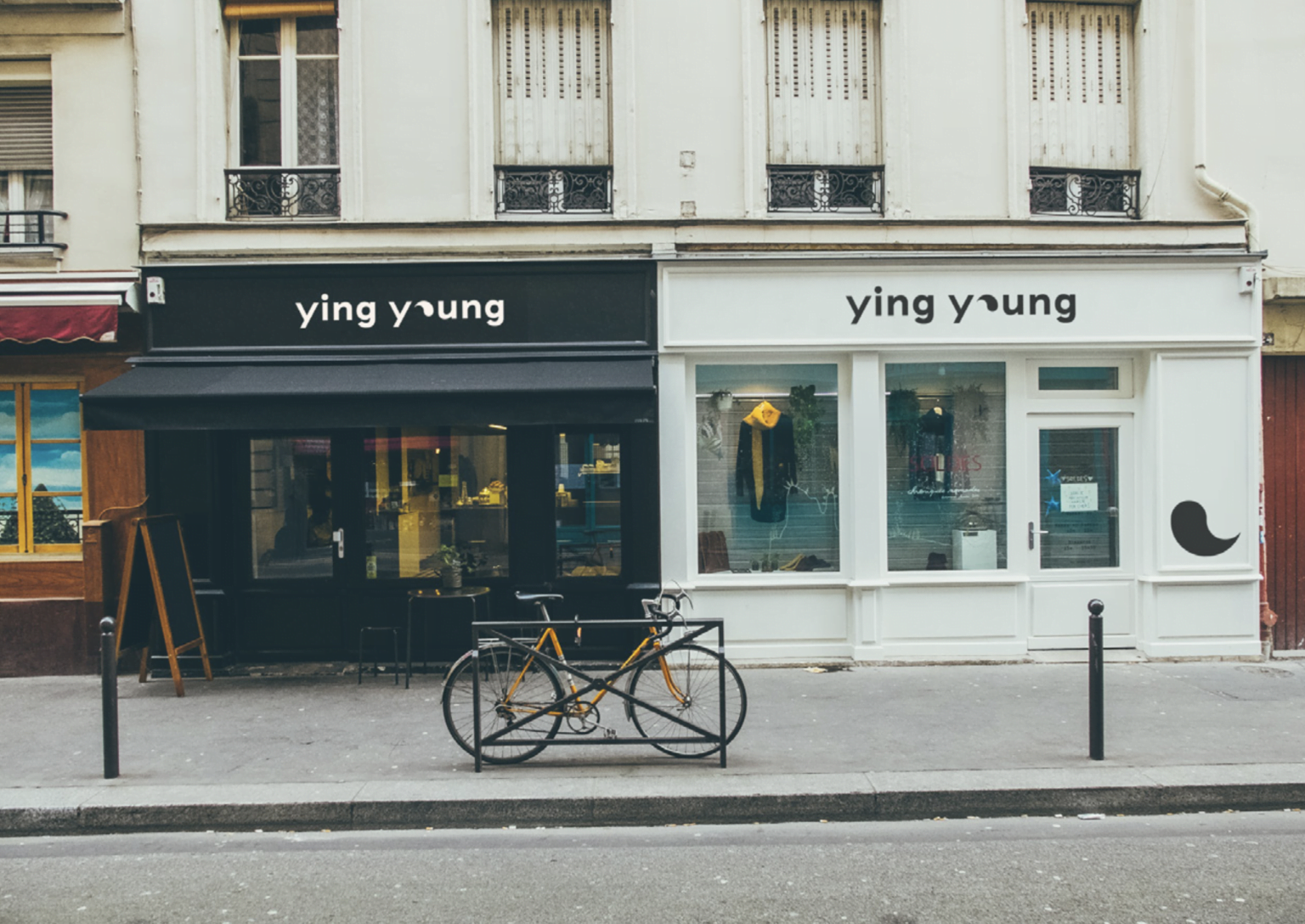
For the logo, we illustrated the O in Young to represent the Yin and Yang symbol, which also became the brand symbol. This imagery is all about movement and growth — perfectly portraying the ever-in-flux nature of adolescence.
Beige and dark gray were selected as the primary brand colors, as they fitted with the brand’s caring yet practical positioning. On the other hand, we picked more lively and bright secondary colors to resonate with the dynamic nature of Generation Z.
With a solid strategy and a committed and empathic execution from our creatives, the visual and textual universe was established. Ying Young has transformed into a brand with a unique identity and a timeless essence for today’s Generation Z — and future generations to come.